



嶼森之日
World Nature Conservation Day
海報編排 / 標準字設計
島嶼與森林有關的日子
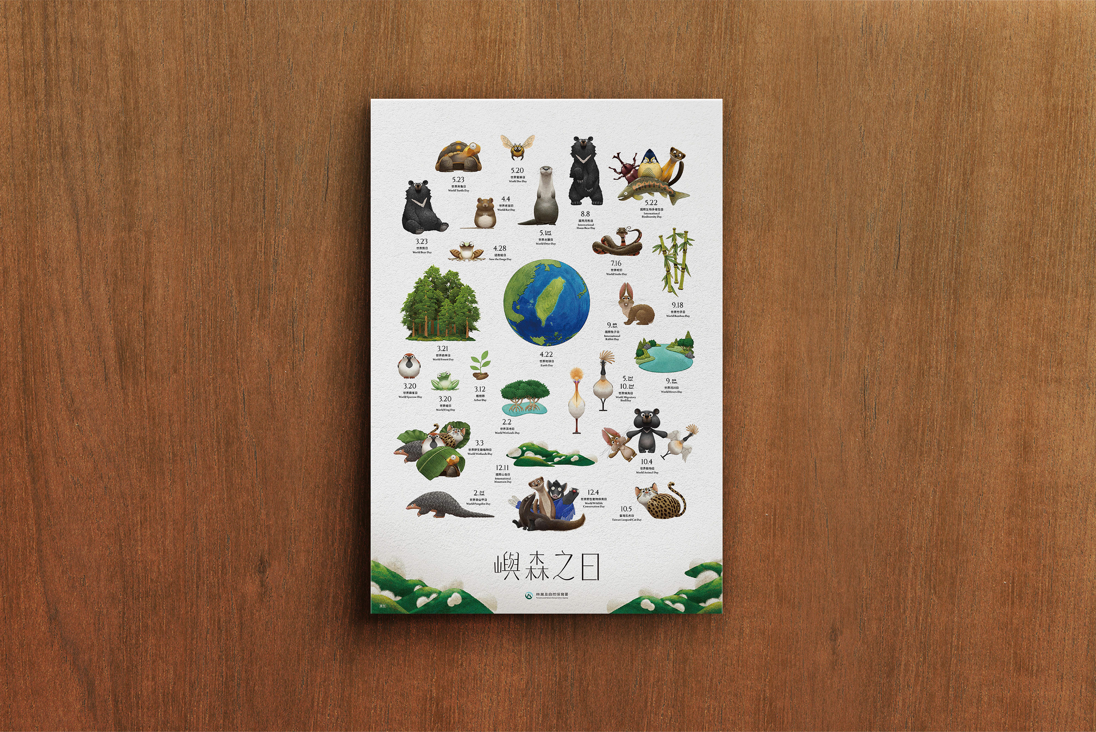
宣傳世界各種保育節日的海報
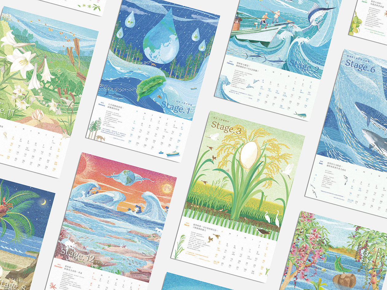
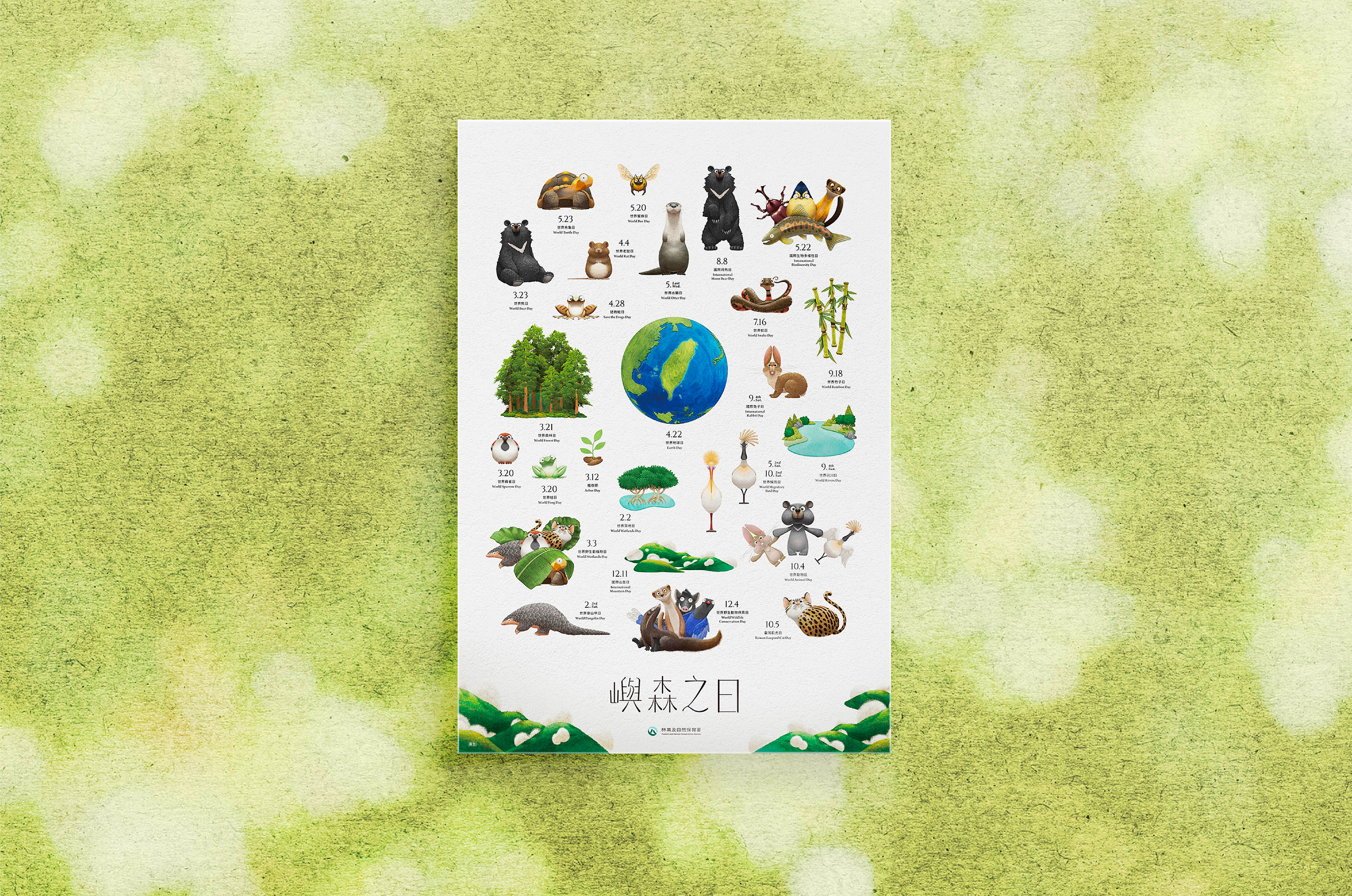
Commissioned by the Forestry and Nature Conservation Agency (FNCA), this poster series was created to promote a variety of conservation awareness events through illustrations inspired by Taiwan's native wildlife.
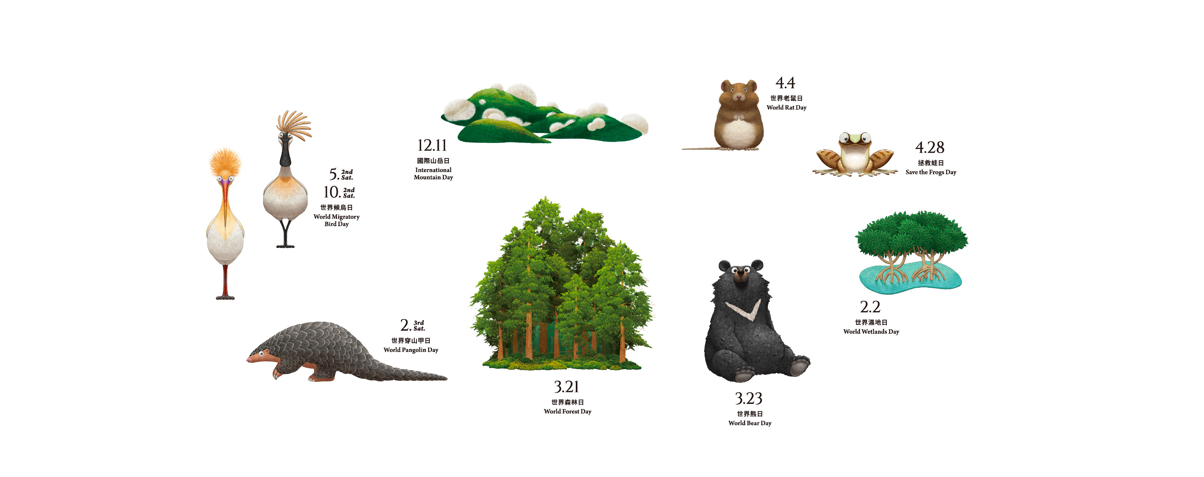
The illustrations depict animals in their natural habitats with delicate brushstrokes and lifelike poses. Richly layered coloring and the interplay of light and shadow create a vivid sense of depth and vitality. Intricate details in the fur, foliage, and natural textures strike a harmonious balance between realism and playfulness.
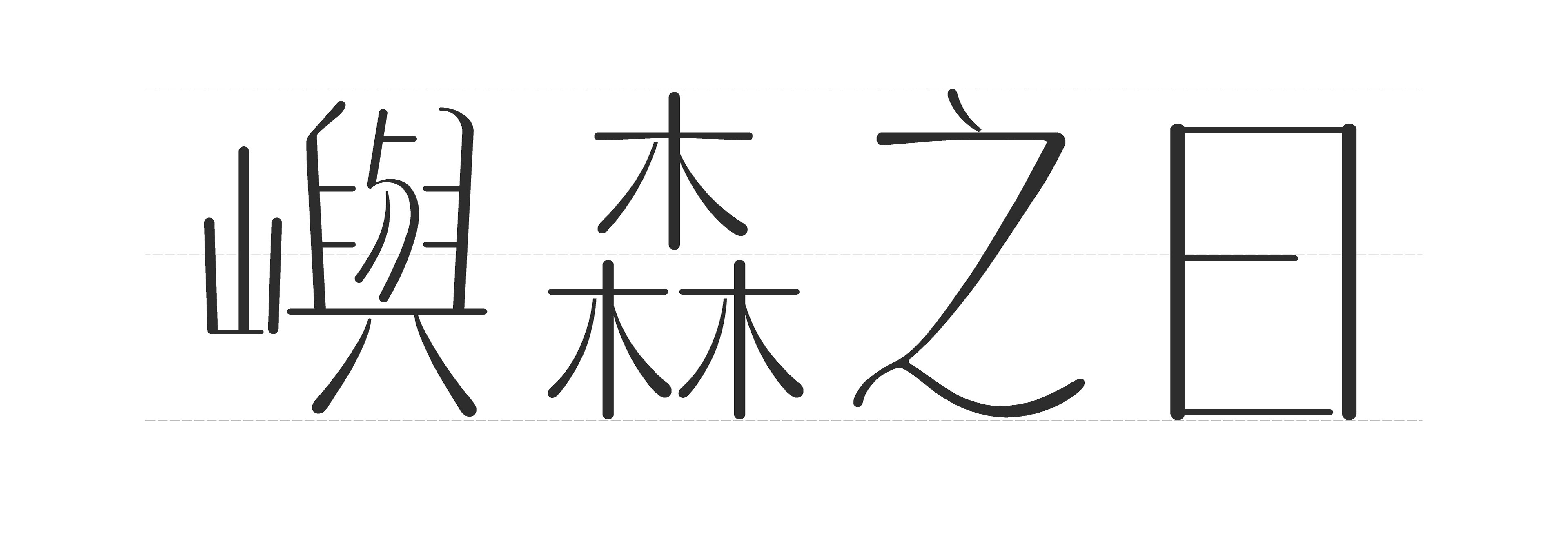
The custom logotype is built around the concept of Organic Geometric. Flexible strokes and rounded forms echo the soft, organic qualities of the illustrations, allowing the typography and imagery to blend seamlessly into a warm and cohesive visual identity. Gentle curves and softened corners give the letterforms a sense of rhythm and vitality while maintaining structural clarity, reflecting the brand's philosophy of coexistence with nature through a gentle, enduring, and harmonious visual language.



林業及自然保育署委託製作以台灣土地動物出發,設計海報推廣各種保育節日。
插畫以細膩的筆觸與自然的姿態描繪動物與環境,透過層次豐富的上色與光影變化,呈現出具有立體感與生命力的畫面。絨毛、樹葉與自然紋理的細節,使整體視覺在寫實與趣味之間取得平衡。
插畫以細膩的筆觸與自然的姿態描繪動物與環境,透過層次豐富的上色與光影變化,呈現出具有立體感與生命力的畫面。絨毛、樹葉與自然紋理的細節,使整體視覺在寫實與趣味之間取得平衡。
插畫 / @chimiwangillustration
設計 / @nataolito
CLIENT / 林業及自然保育署
設計 / @nataolito
CLIENT / 林業及自然保育署
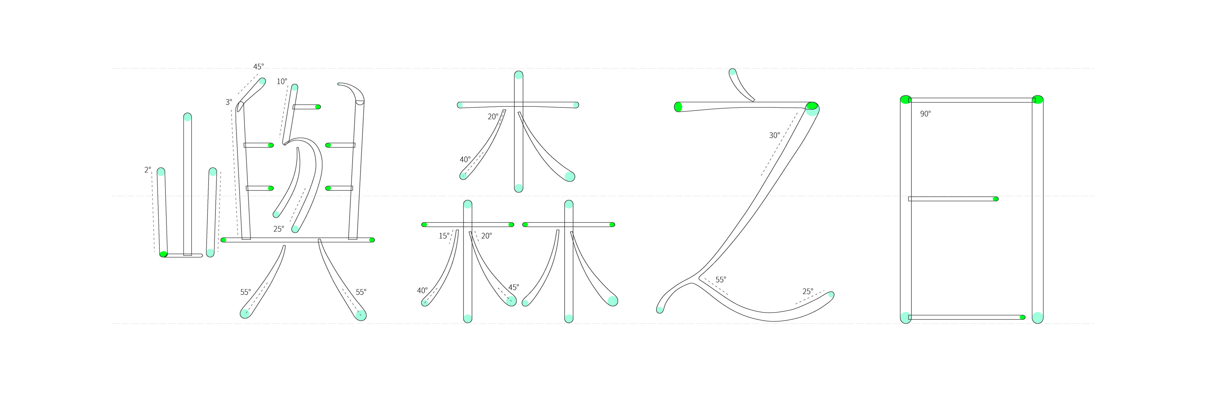
有機幾何 Organic Geometric 結構理性但線條自然柔軟。
柔韌 Flexible 線條有彈性,不僵硬。
無襯線 Soft Sans 現代、乾淨。

Thanks for watching!
Follow me at Instagram