蝸牛在混音 名片設計
Happy Mixing Studio Business Card Design
#活版印刷 #燙金印刷 #Foil Stamping #Embossing
CLIENT
Happy Mixing Studio is a professional mixing studio built on a human-centered brand philosophy. Guided by the principle of “Slow but perfect.”, the brand embodies a snail-like spirit—combining technical precision in mixing and recording with a warm, thoughtful service approach. Their clientele includes VTubers, independent artists, and music enthusiasts.
ASSIGNMENT
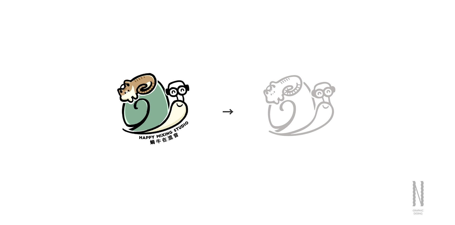
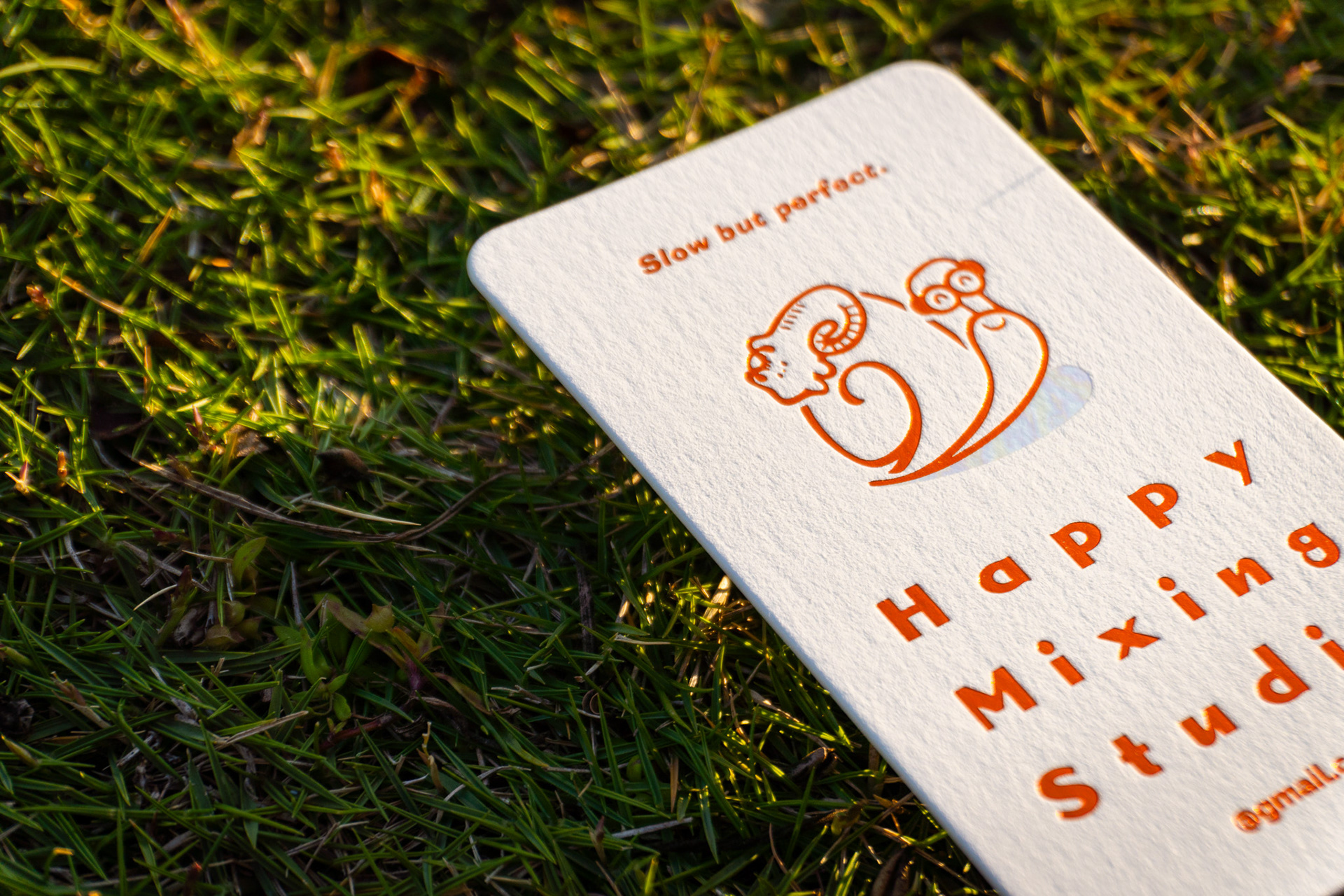
The client sought a visual direction that could express both professional expertise and emotional warmth. While preserving the original logo style, the goal was to strengthen the brand identity through the introduction of new typography.
The project aimed to break away from the industry's typical sense of coldness and distance, creating a business card that goes beyond a simple exchange of contact information. Instead, it becomes a brand-representative collectible, carrying a membership-like quality that fosters a deeper, more personal connection with a contemporary audience.
SOLUTION & PROCESS
The visual concept centers around the idea: “Every path taken continues to glow.”
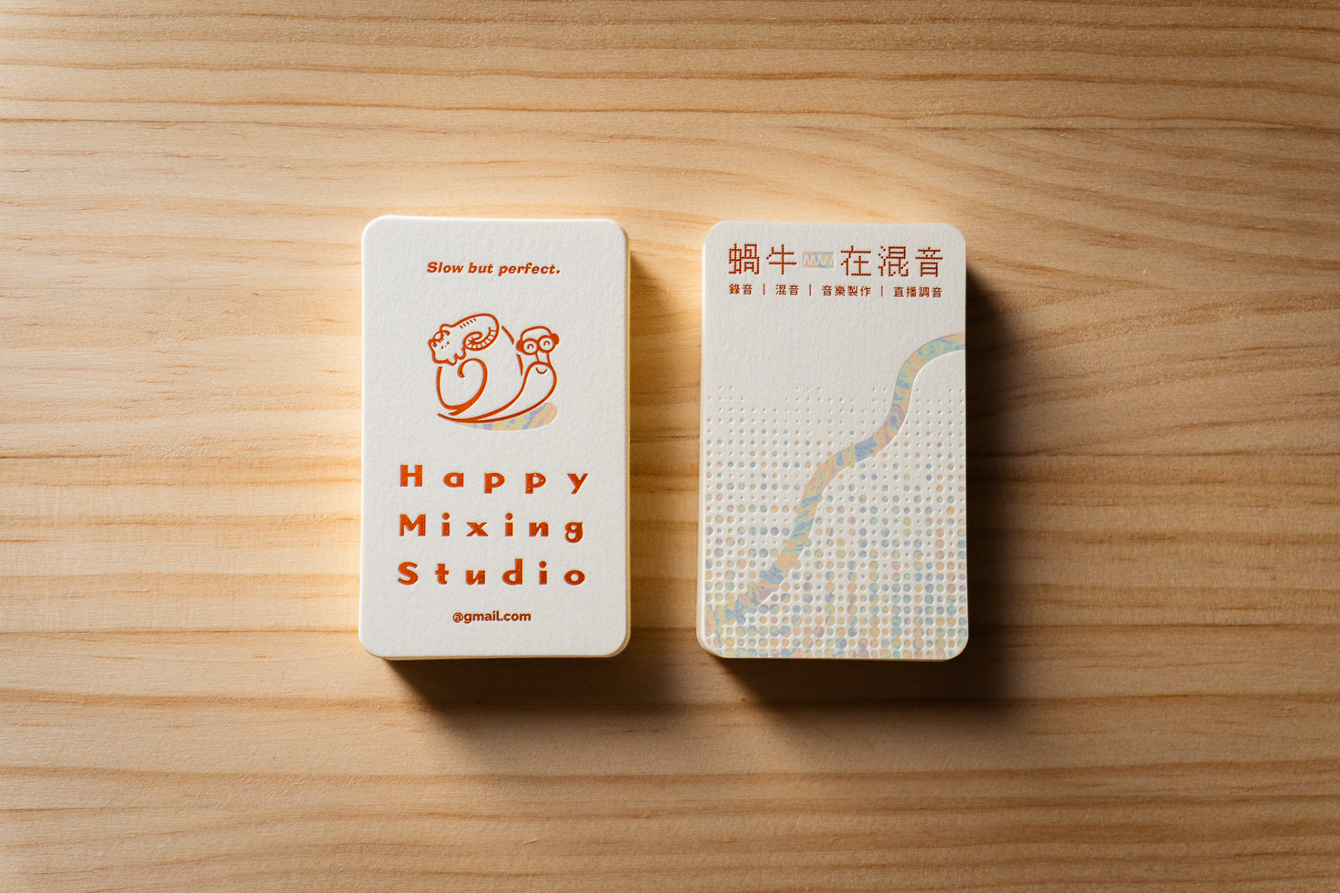
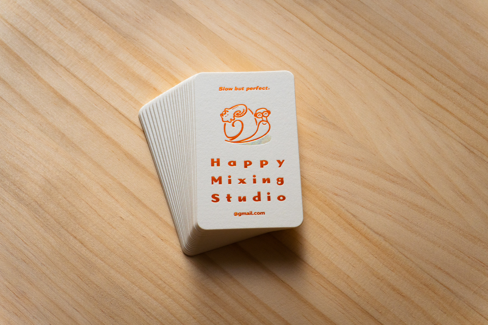
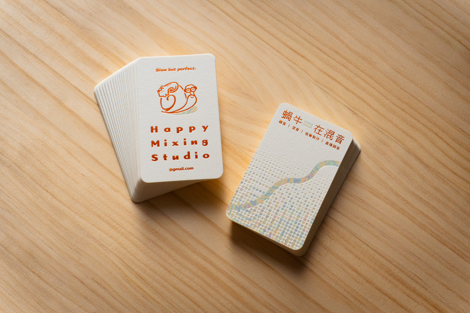
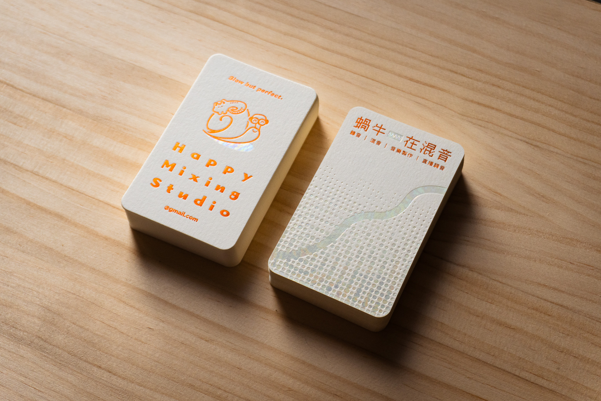
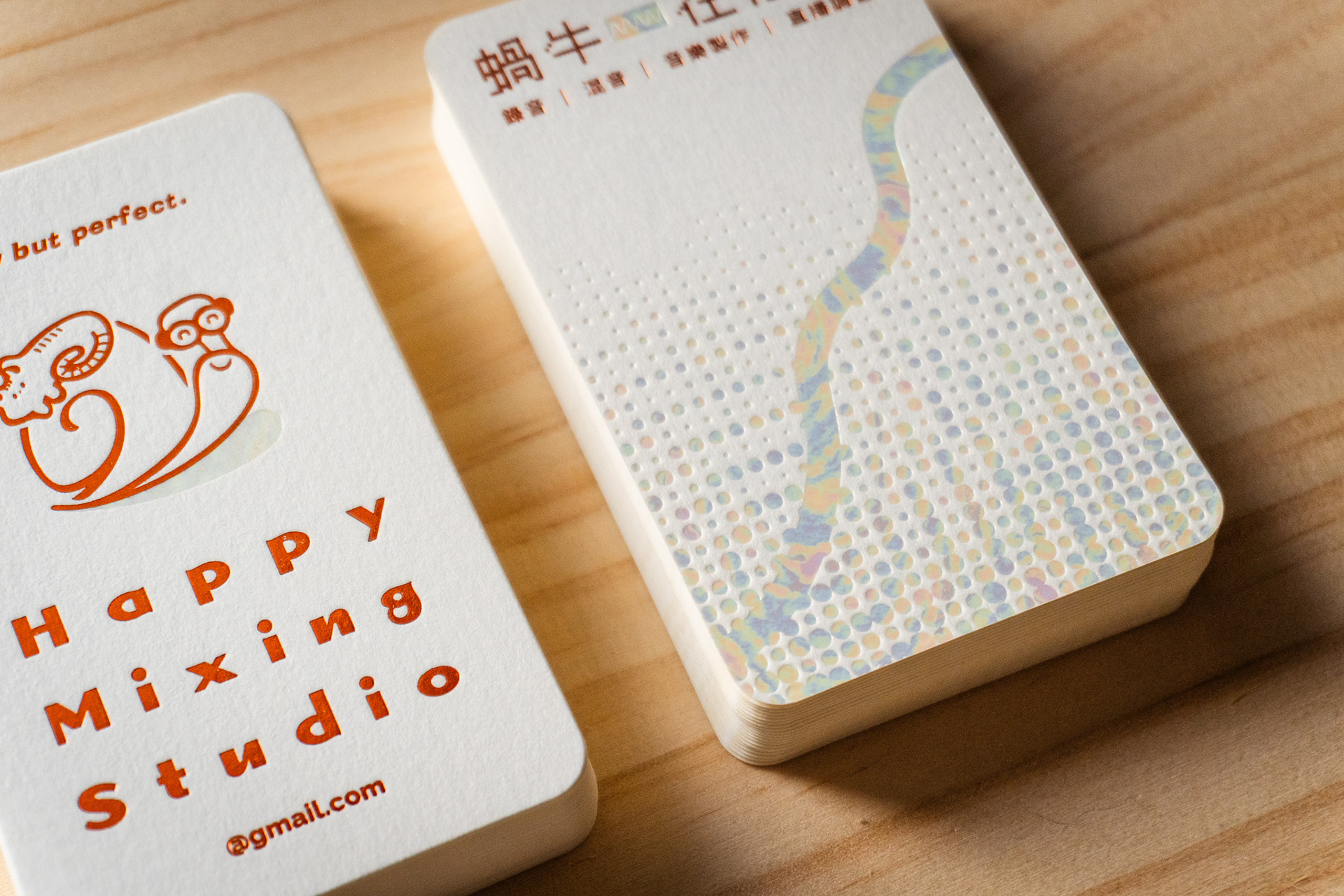
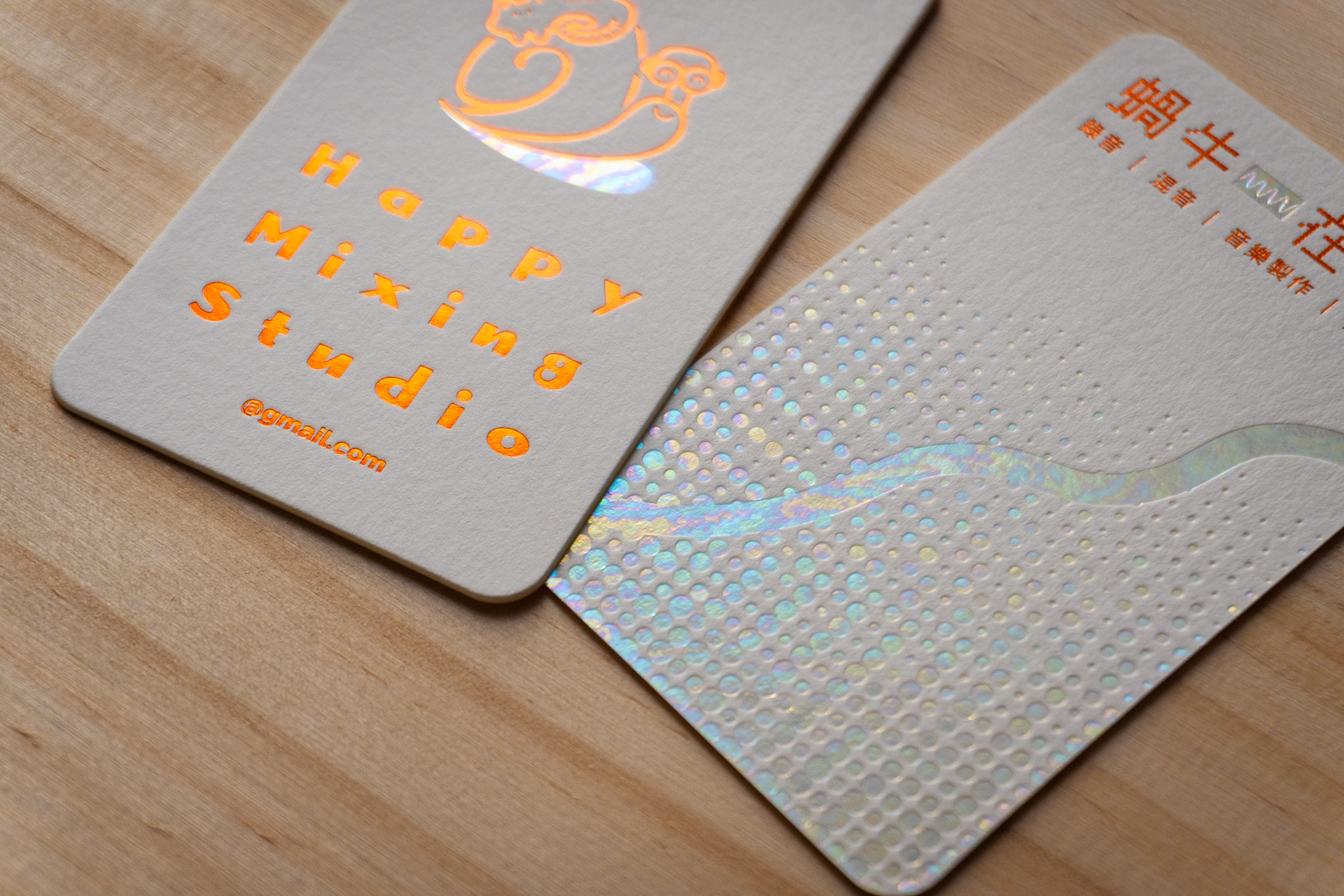
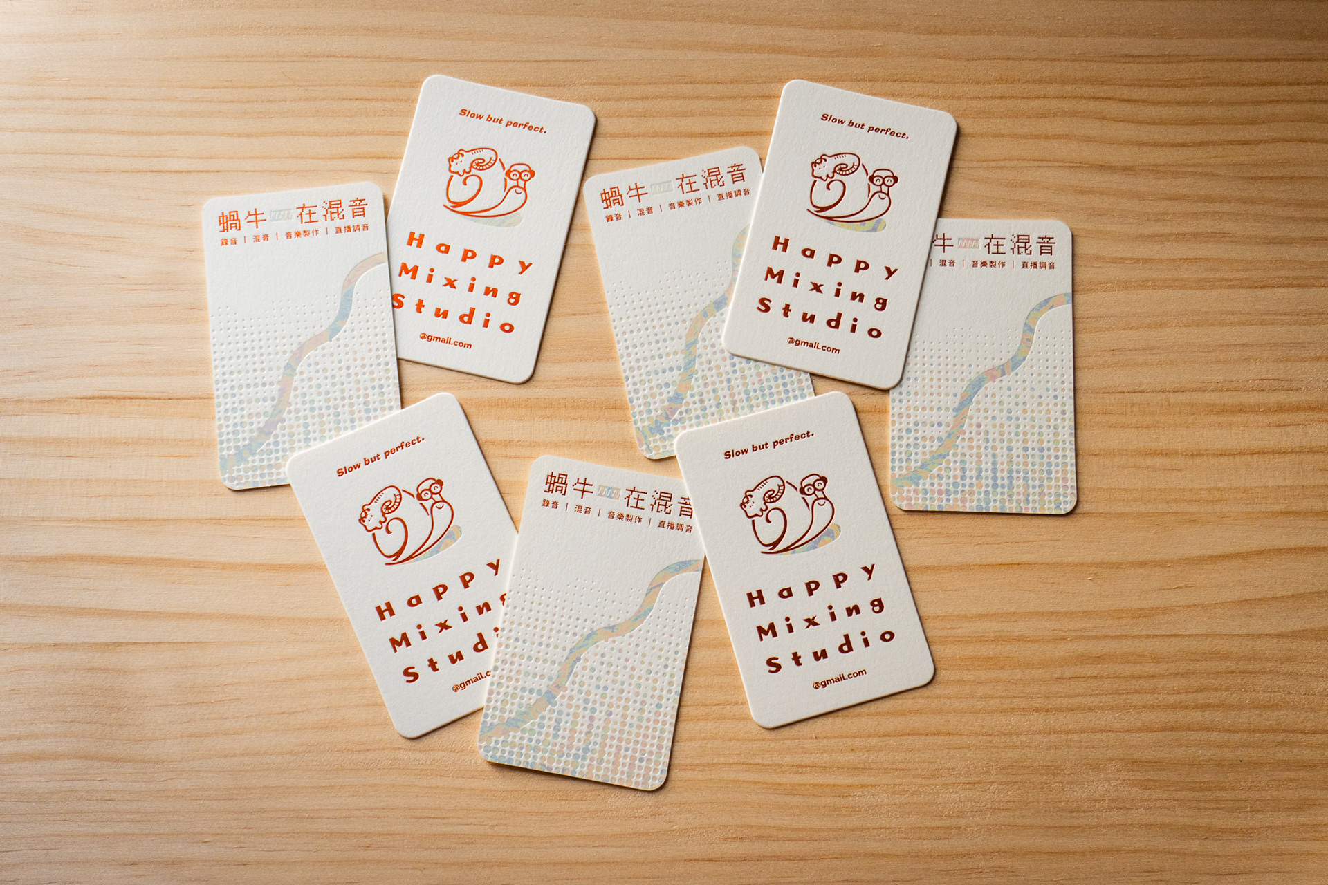
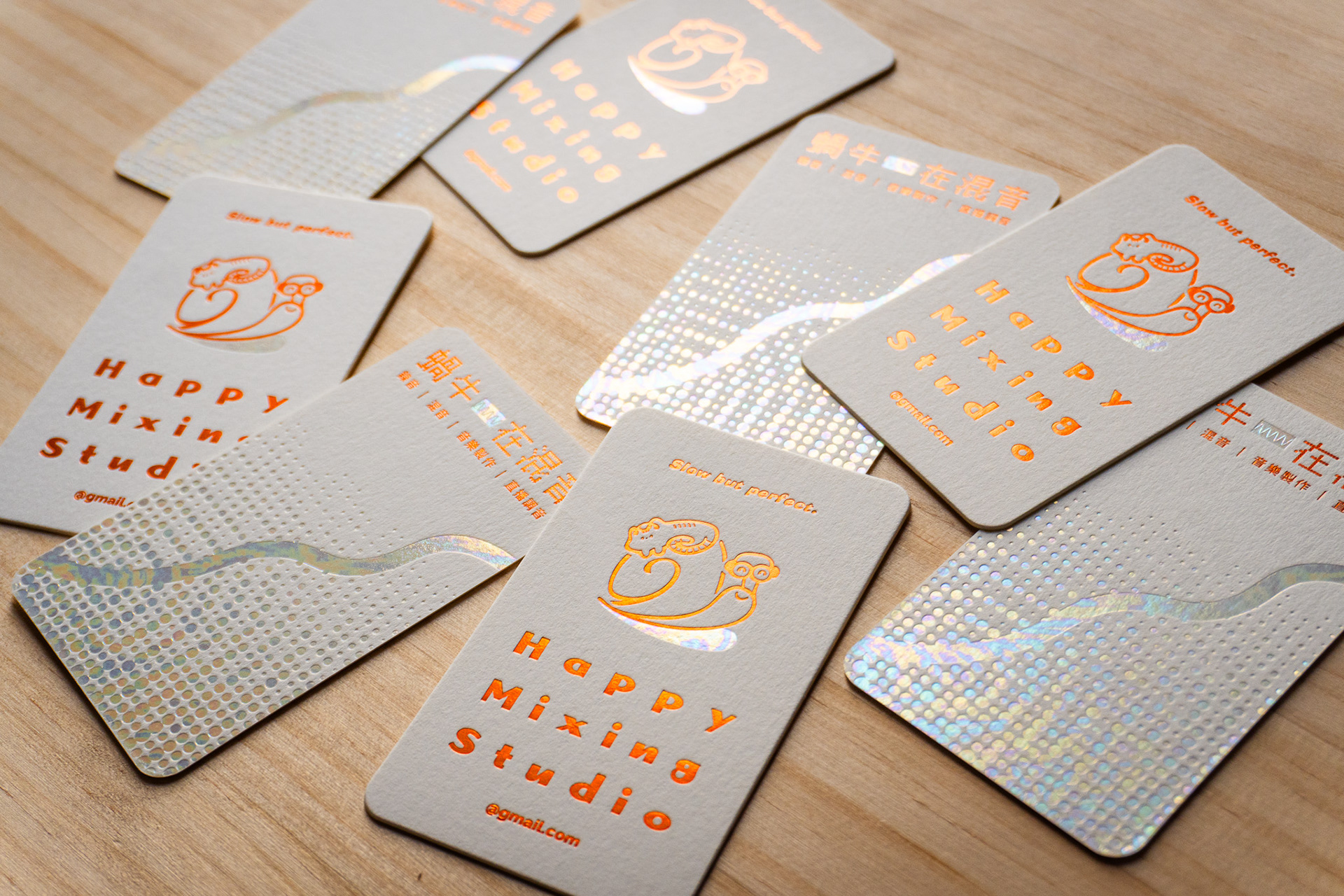
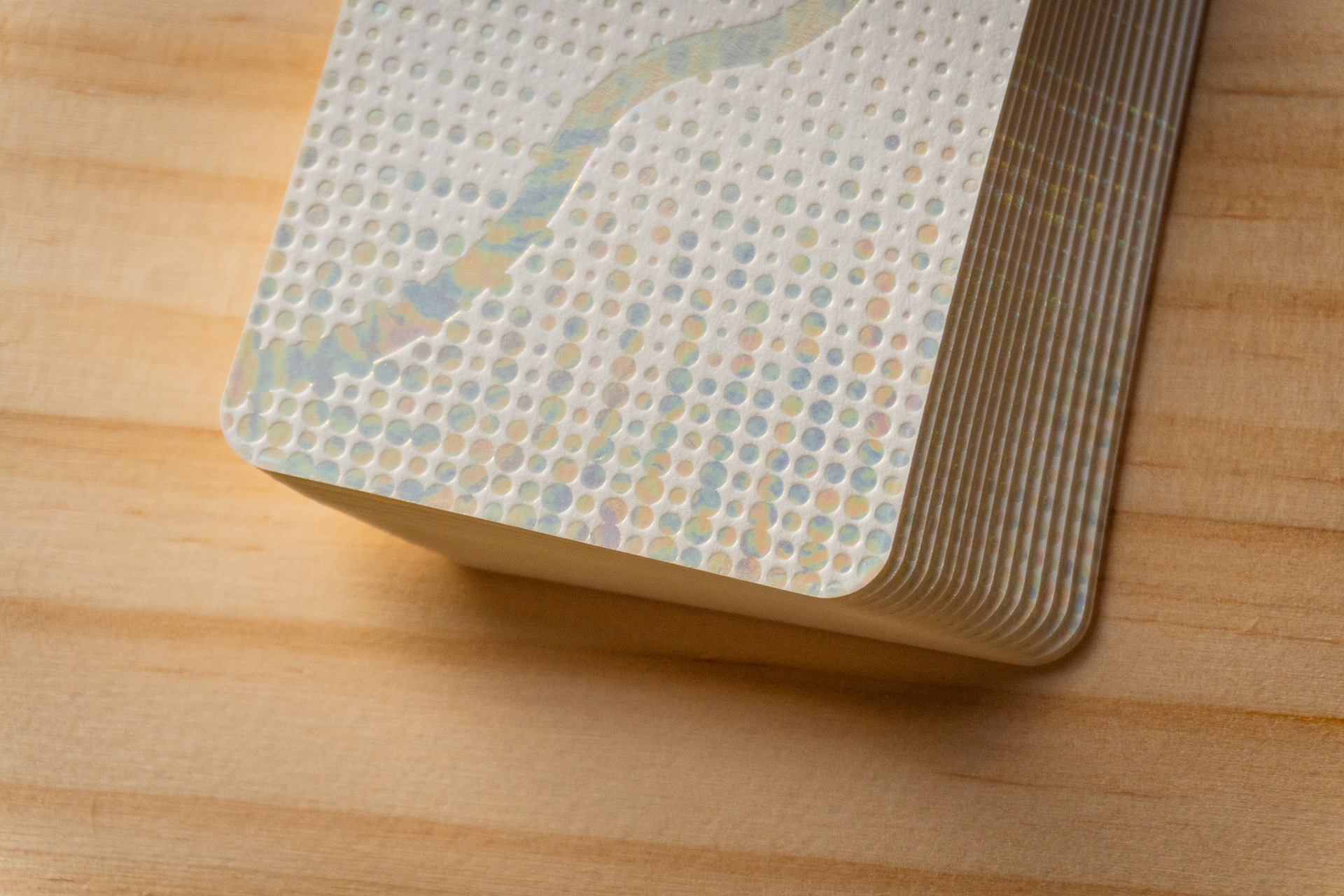
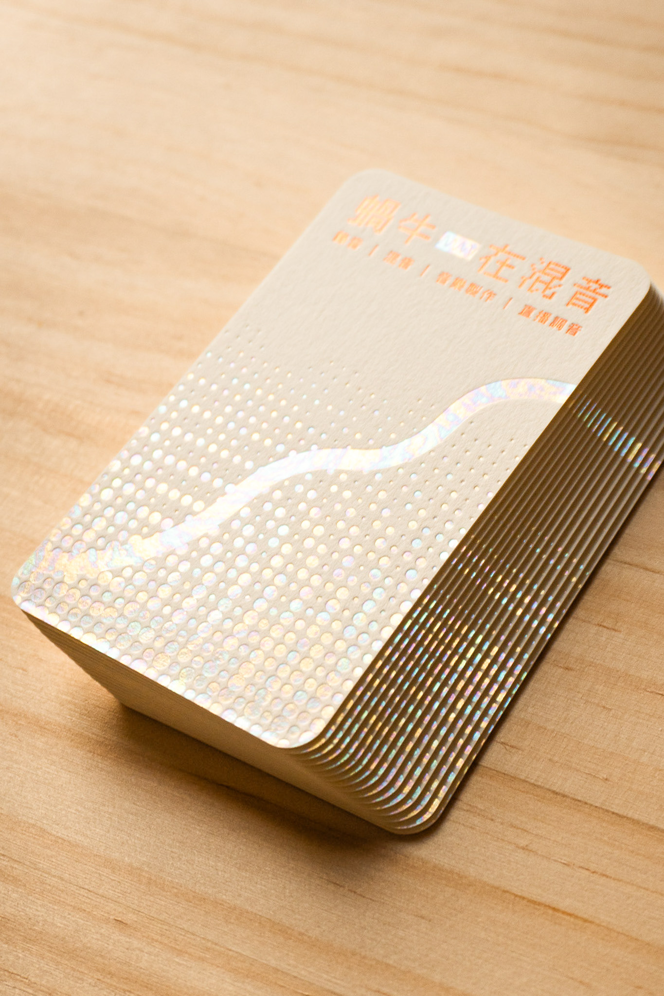
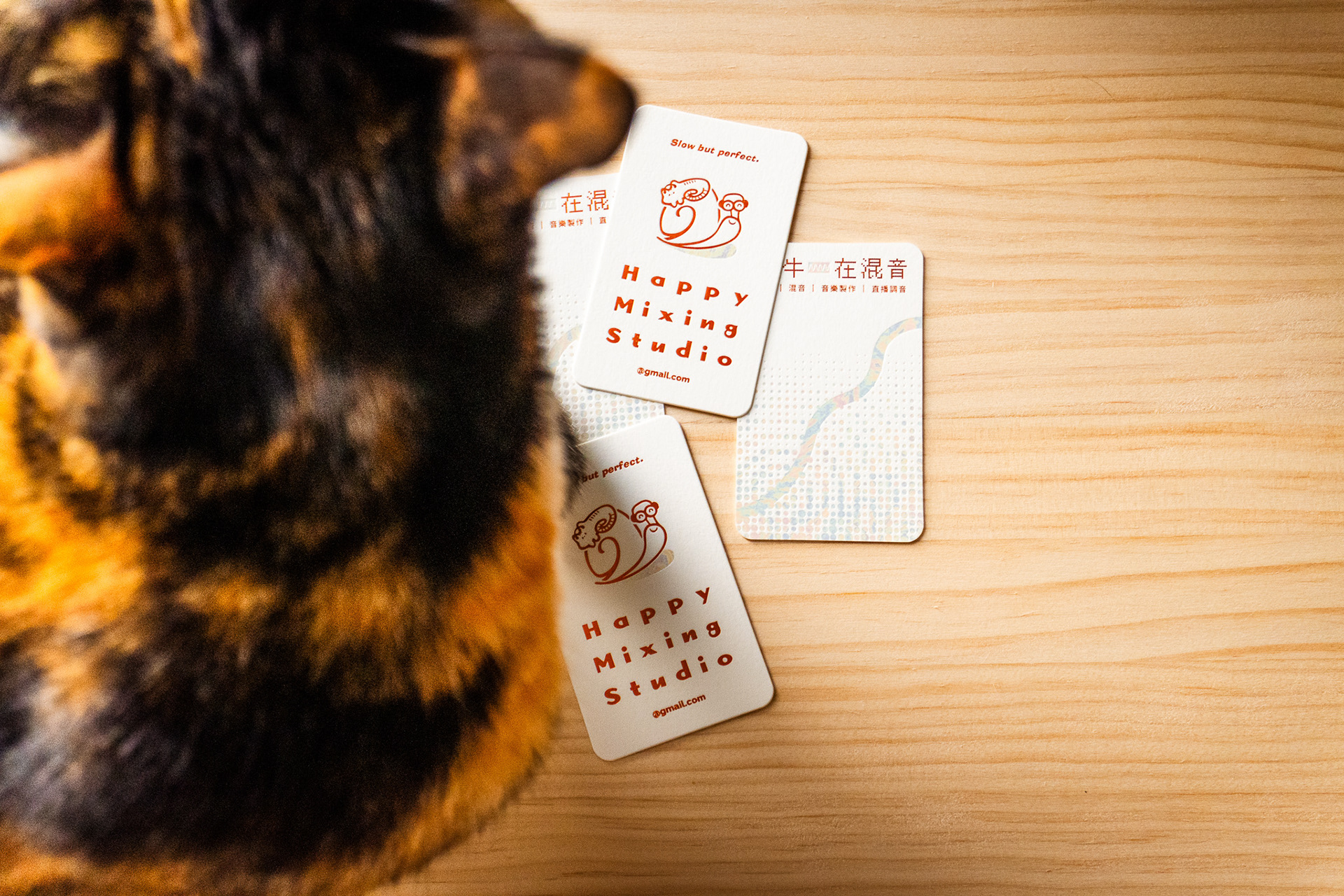
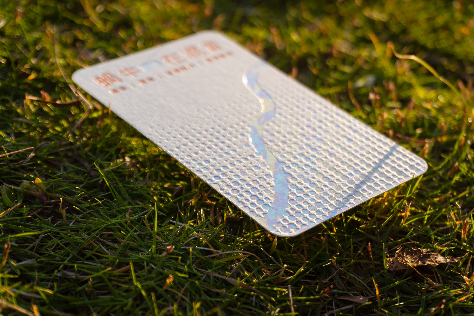
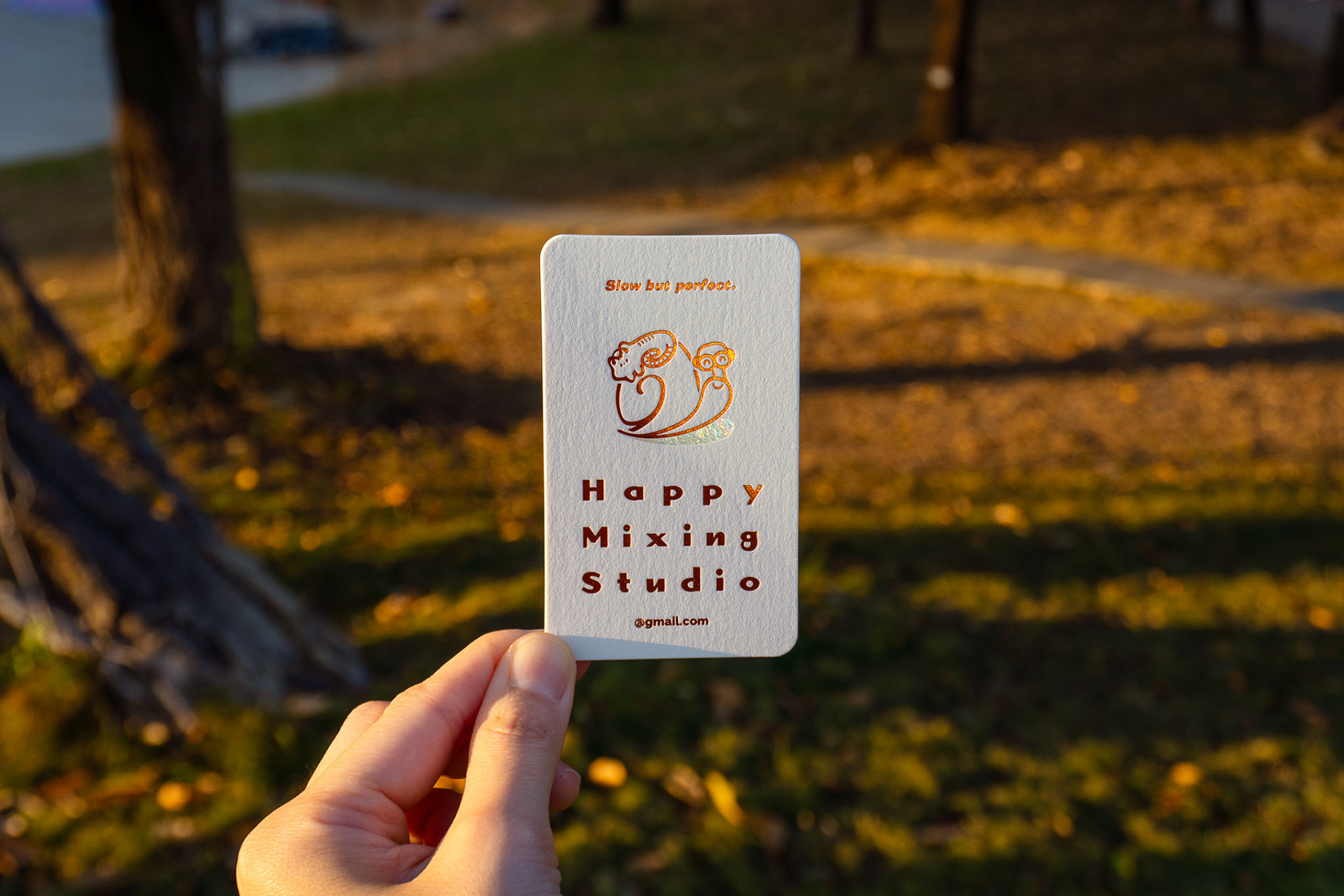
Inspired by the neon-like trail left behind by a snail, the design symbolizes both the brand’s persistent journey and the unique brilliance of each music creator. Through the use of semi-transparent foil stamping and deep embossing techniques, the design recreates a sense of physical depth on printed material.
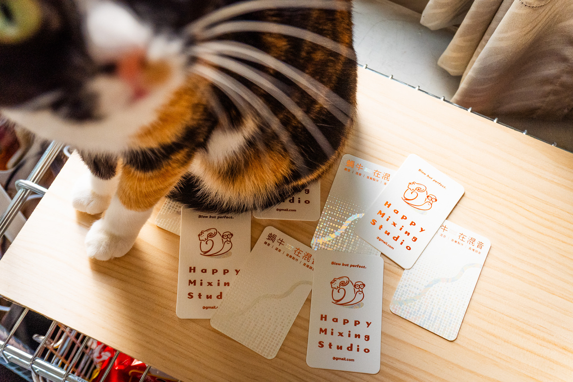
In response to modern digital habits—where social connections are often exchanged face-to-face via online platforms—the content of the business card is intentionally minimized. The focus shifts toward creating a strong visual first impression and enhancing its value as a collectible piece.
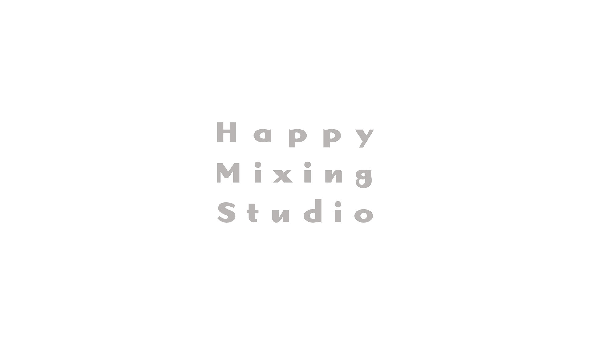
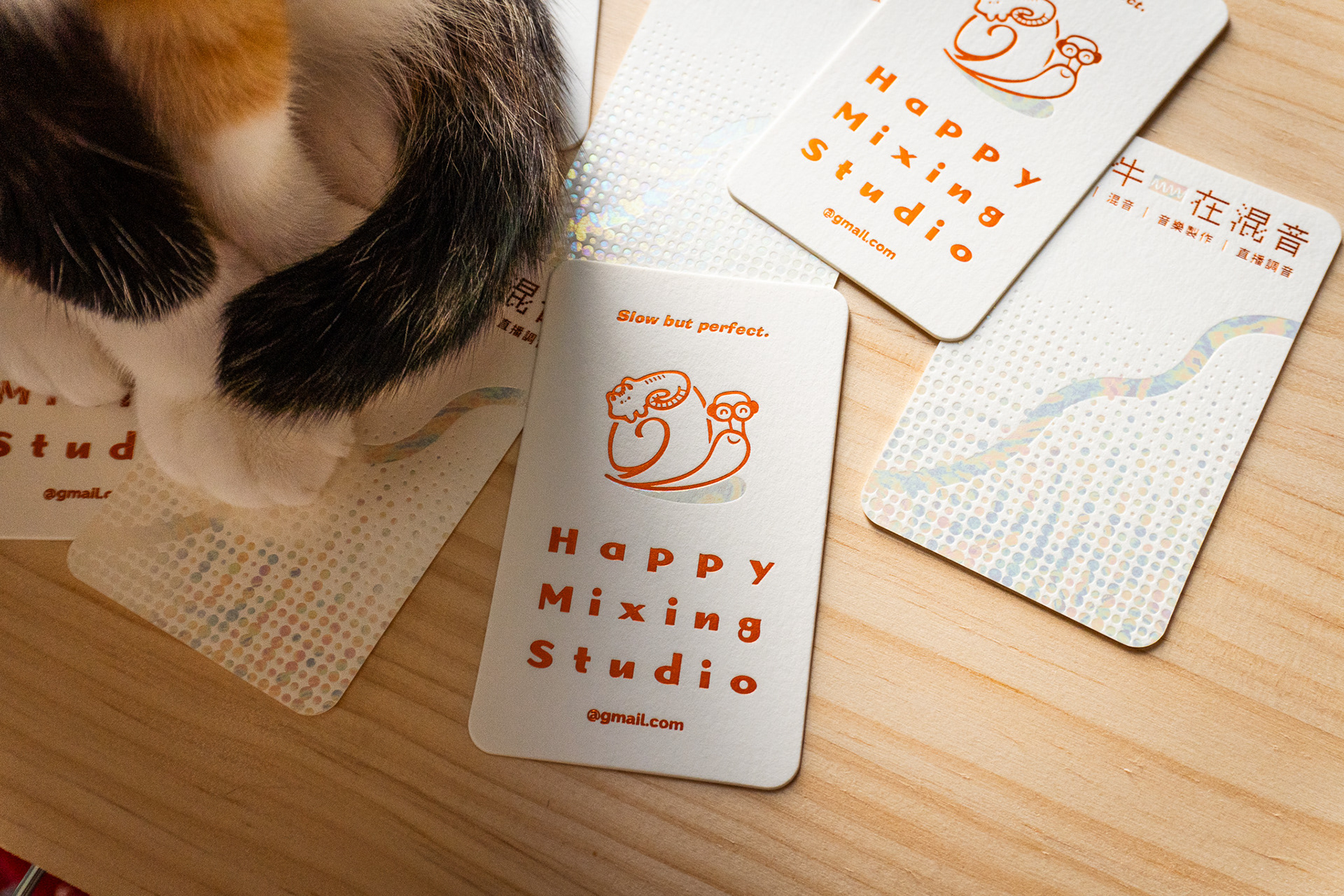
Typography plays a key role, featuring rhythmic spacing and soft, flowing curves to evoke a sense of musicality and ease. The color system is built around a vibrant, warm orange, representing youthfulness and approachability. Layered dot patterns further echo the essence of audio mixing, symbolizing the accumulation and interaction of sound waves.
Designer: Nata
Photography: Nata
Printing & Craft: Teleportpress
YEAR / 2026
客戶
Happy Mixing Studio 是一家專業混音工作室,一個以人為本的品牌。 基於「Slow but perfect.」蝸牛般的品牌哲學,致力將混音、錄音工程的技術精準度與充滿溫度的服務結合,對象涵蓋 VTuber、獨立歌手及廣大的音樂愛好者。
目標
客戶尋求一種既能體現「專業能力」又能傳達「情感溫度」的視覺方向,在保留原有標誌風格的基礎上,透過新字體的導入強化品牌調性。 任務目標是打破產業冰冷距離感的既定印象,打造一張不只是交換聯繫方式、而是能代表品牌個性的「名片周邊」。這款設計兼具質感收藏價值,同時有會員卡視覺感受,與當代受眾建立更深層、更具個人化的連結。
設計理念
視覺設計呈現核心概念 **「走過的路會永遠發光」** 靈感源自蝸牛爬行後留下的霓虹足跡——象徵品牌堅持不懈的過程,以及音樂創作者們各具色彩的光芒。利用半透明燙箔與深壓打凹技術,在實體紙材上重現物理性的視覺深度。
因應數位時代的資訊存取習慣,多數為面對面的場合追蹤社群帳號,我們簡化了名片的文字內容,將重心轉向視覺第一印象與收藏留念的價值。在字體選用上,透過具節奏感的字距與圓潤流動的線條,傳遞音樂的律動與輕鬆感。色彩計畫以充滿活力的溫暖橘色為品牌核心,象徵年輕與親和力;並以層層律動的圓點陣列,隱喻混音工程中聲波層層堆疊的本質。
#Branding #Visual Identity #Business Card #Typography #Print Design #Graphic Design
#Foil Stamping #Embossing #Minimalism #Music Brand
#活版印刷 #燙金印刷