桃園市政府|周邊商品設計提案
Taoyuan City Government|Merchandise Design Proposal
設計理念 Design Concept
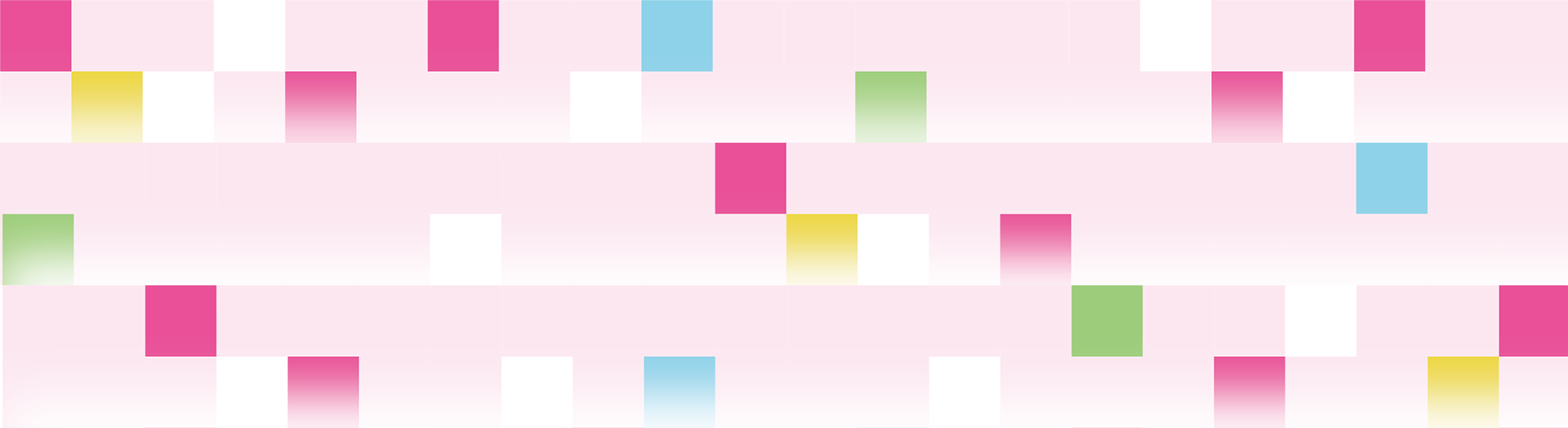
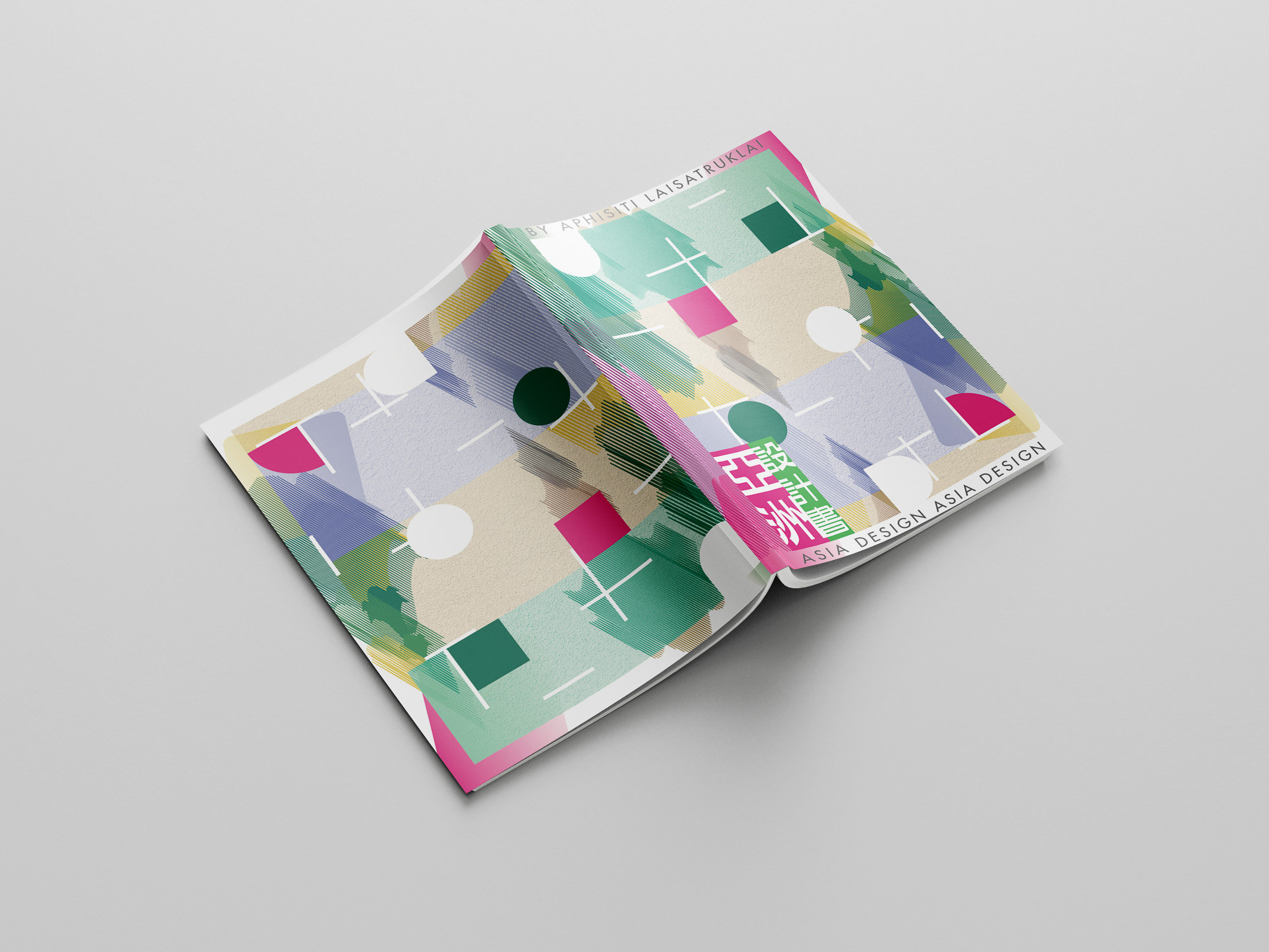
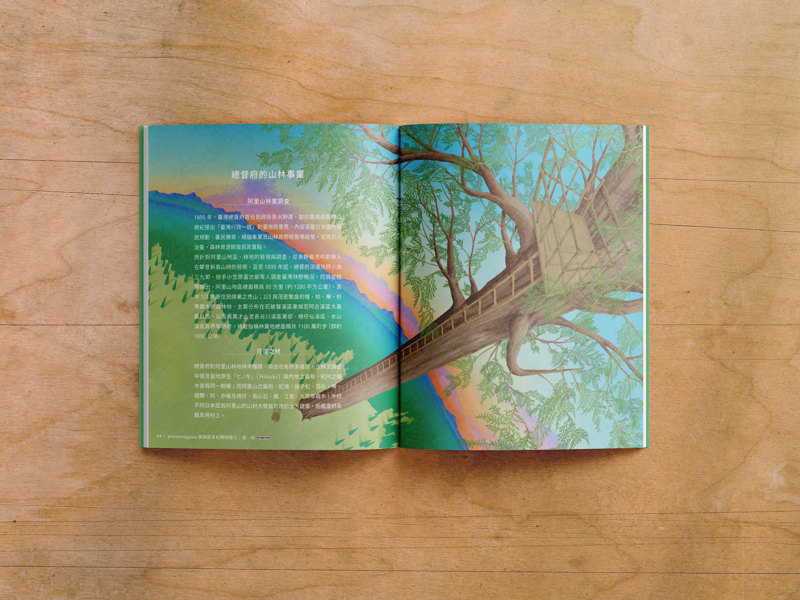
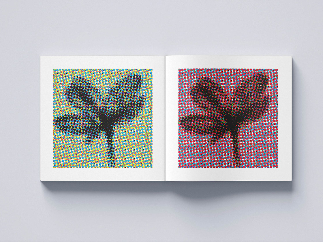
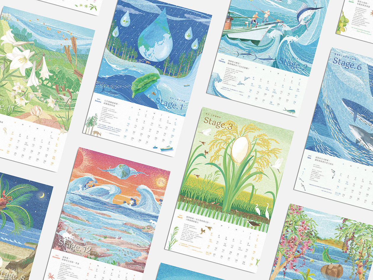
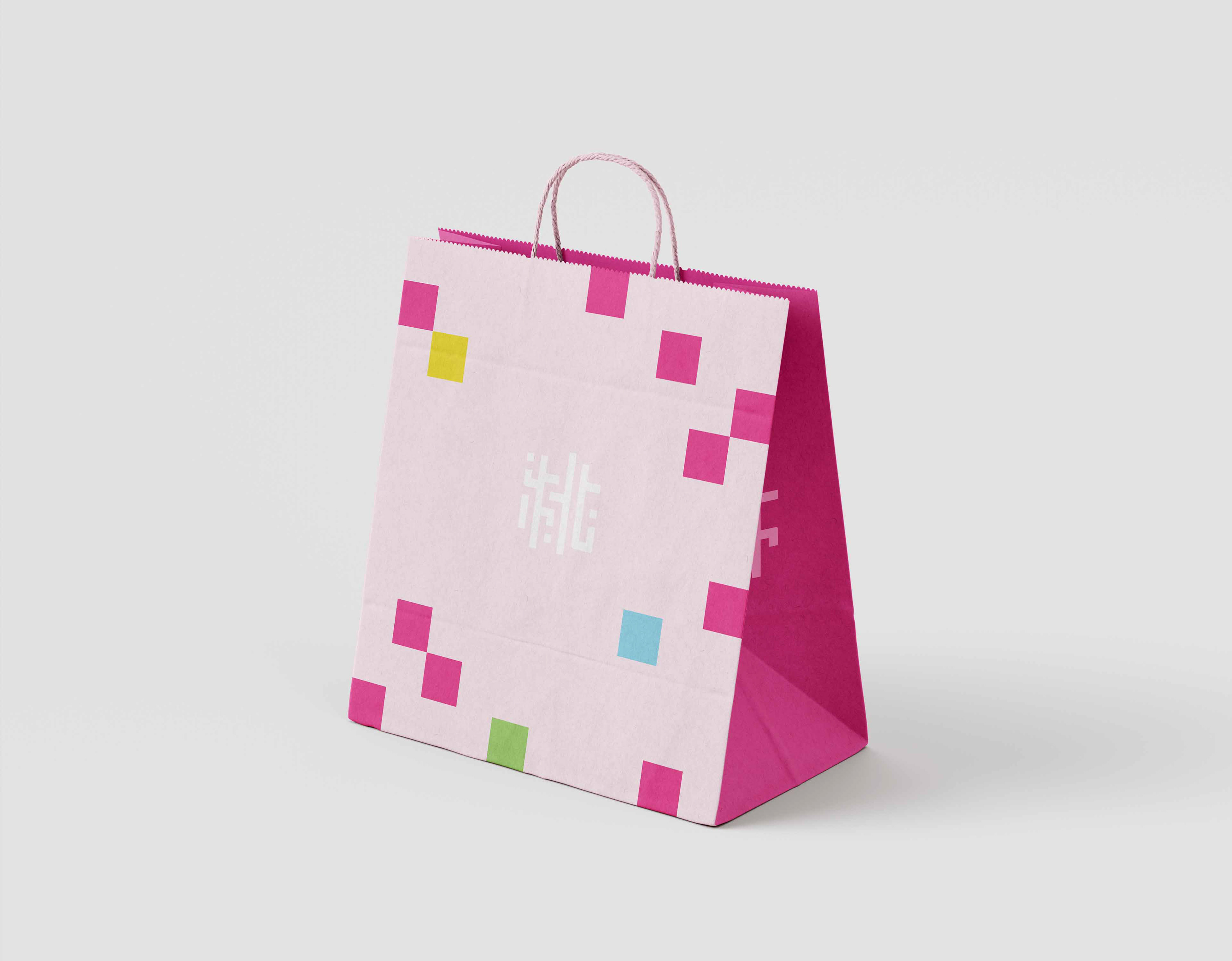
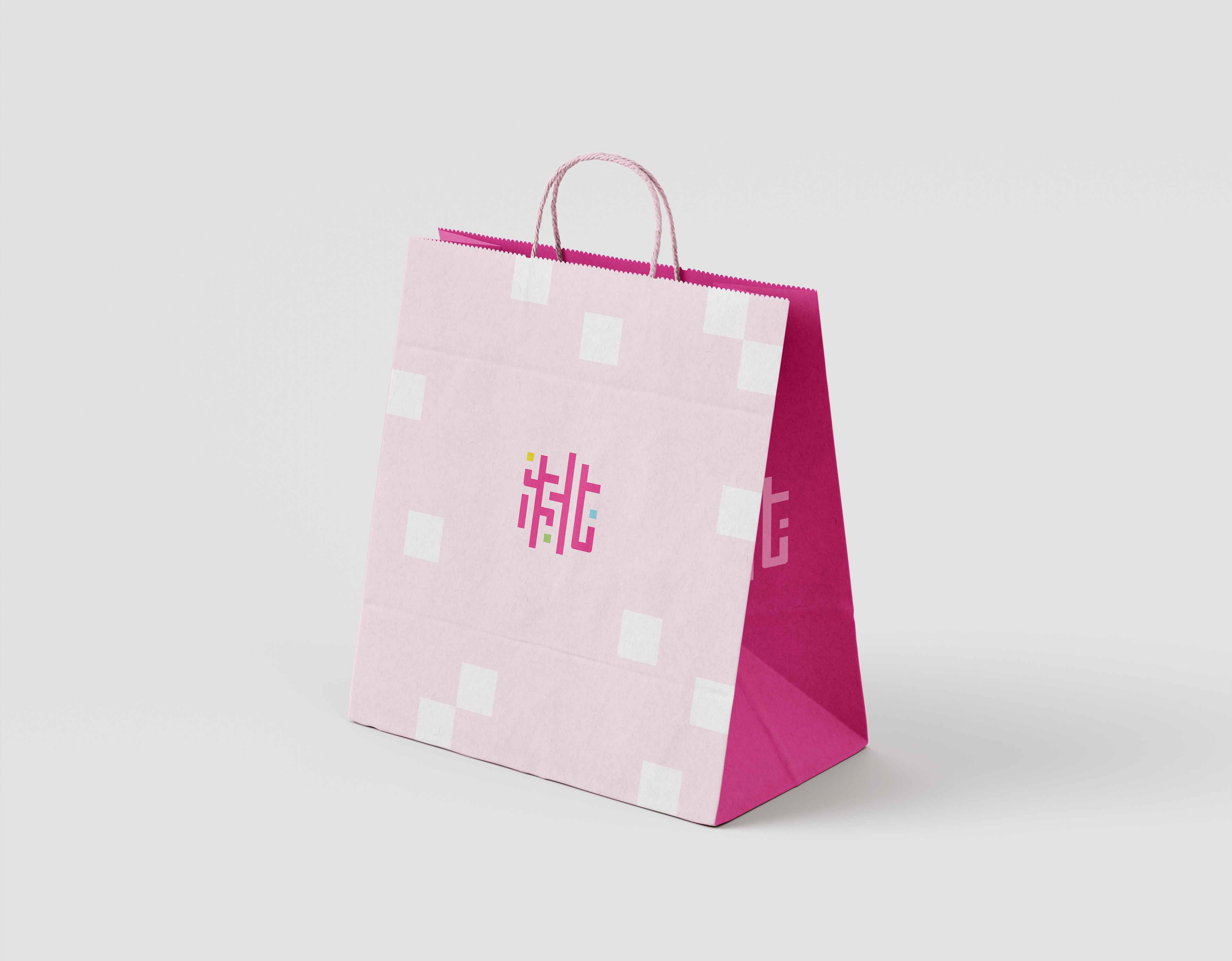
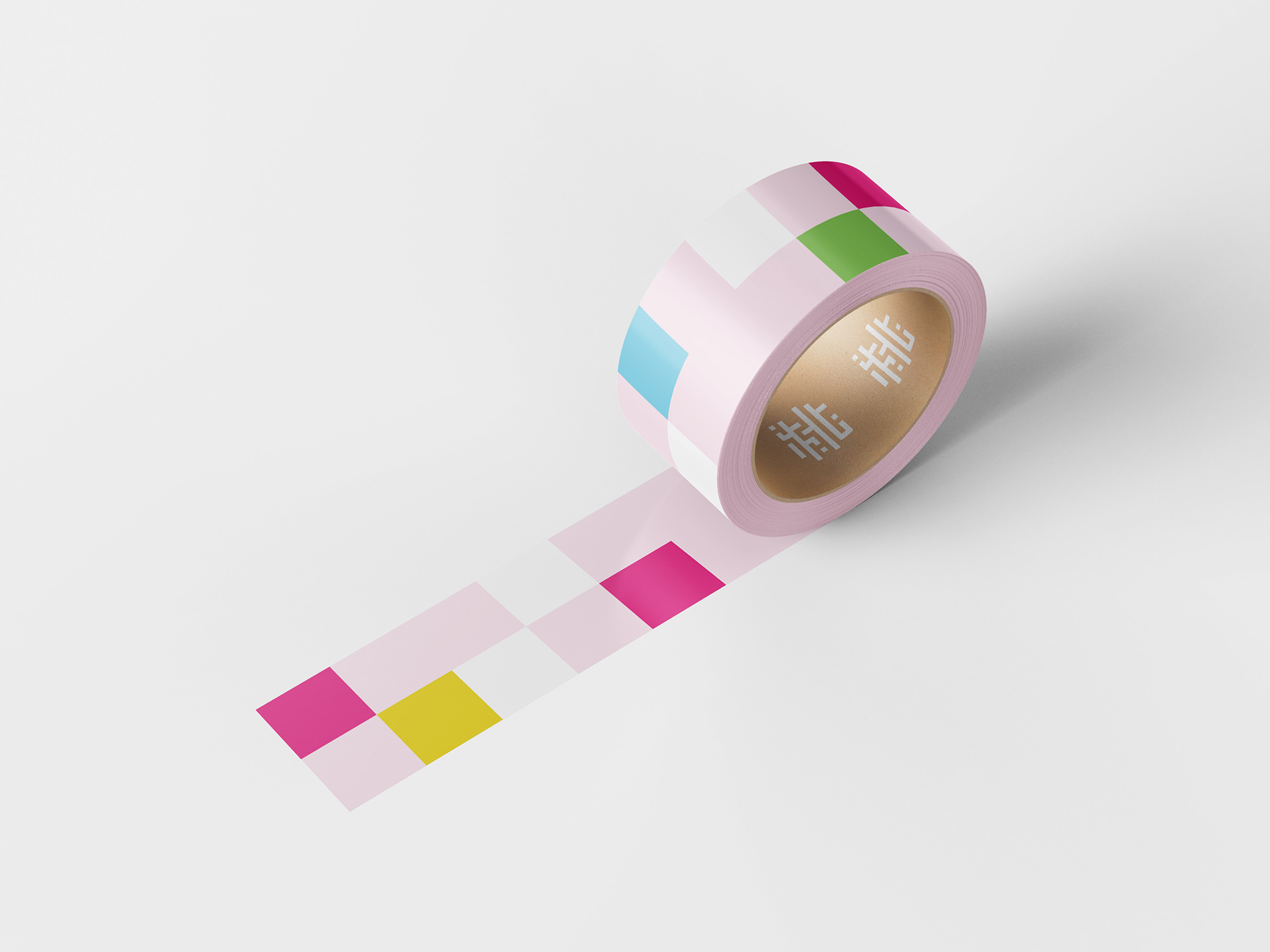
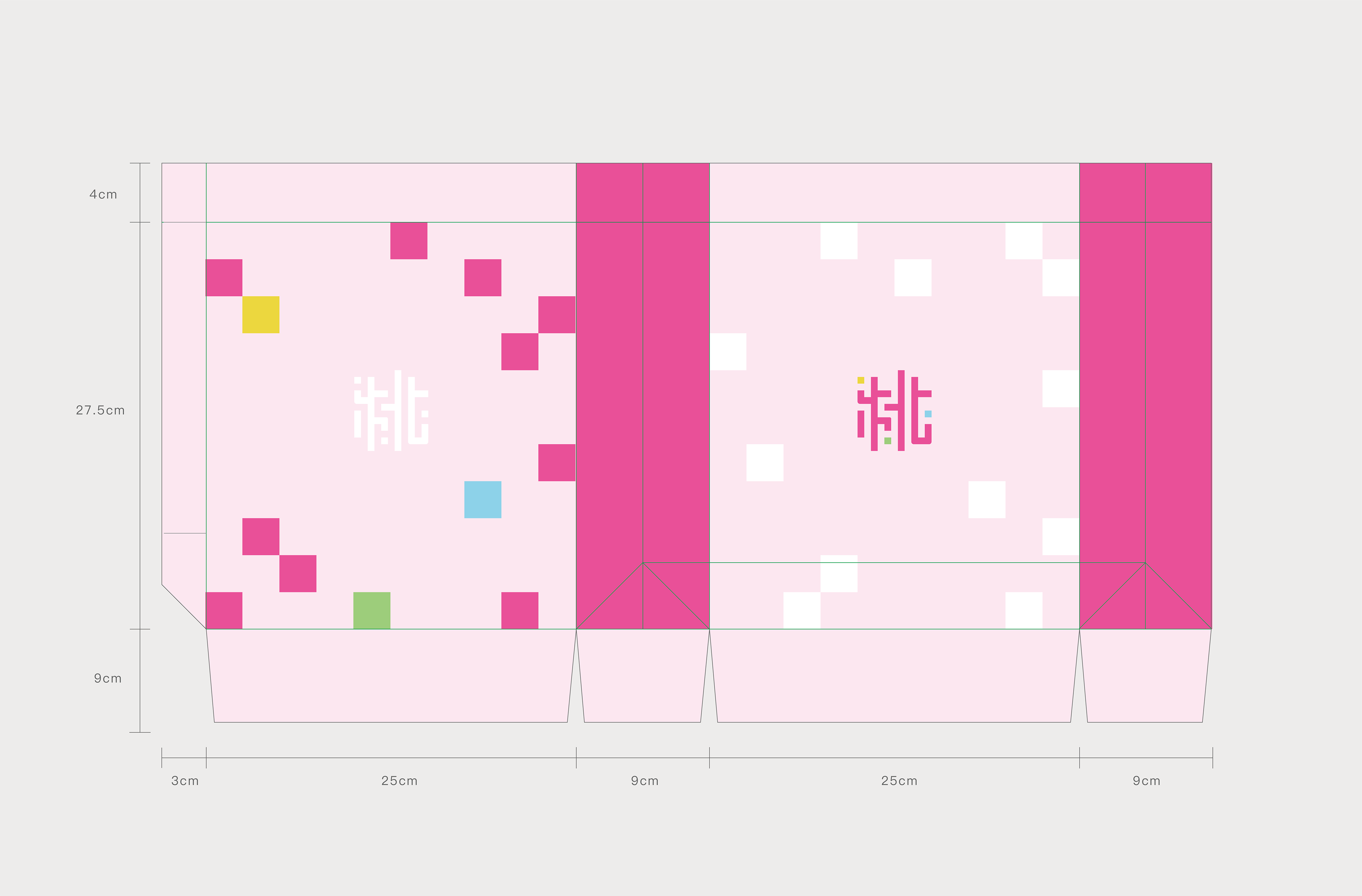
以桃園 LOGO 為核心,轉化為簡約、現代化的視覺元素,幾何化應用,強化品牌識別度。
以桃園 LOGO 為核心,轉化為簡約、現代化的視覺元素,幾何化應用,強化品牌識別度。
This design centers around the Taoyuan City logo, transforming it into a set of minimal and modern visual elements. By applying geometric forms, the identity is reinforced through consistent brand recognition.
色彩搭配 Color Palette
延續 LOGO 色系,營造統一的品牌形象。The original logo colors are extended throughout the design to create a cohesive and unified brand image.
Tags|Merchandise Design・Branding・visual identity・Packaging Design・Colorful
Client|桃園市政府 Taoyuan City Government
Graphic Design|Nata
Graphic Design|Nata
_